Here are best practices for mortgage ad images that can make the difference between someone scrolling past your ad and someone clicking to become your next client.
With social media users spending an average of just 1.7 seconds viewing content on mobile devices, your ad image needs to work instantly.
At Evocalize, we’ve helped 1 million loan officers and local operators generate 9 million leads and over 7 billion ad impressions. Through analyzing thousands of successful mortgage campaigns, we’ve identified exactly what works.
Your ad image is fighting for attention against hundreds of other posts, stories, and ads. It needs to communicate value, build trust, and compel action—all in a split second. Whether you’re a marketing professional designing campaigns for your brokerage or a loan officer creating your first Facebook ad, these design principles will help you create images that actually convert.

Why mortgage ad images matter more than you think
The visual component of your ad carries more weight than any other element. According to MIT research, the human brain can process images in as little as 13 milliseconds. This means your image makes an impression before someone even reads your headline.
For mortgage professionals, this creates both challenge and opportunity.
The challenge: you’re competing with eye-catching content from friends, family, and major brands.
The opportunity: most loan officers and even some marketing teams get ad images wrong, which means applying best practices for mortgage ad images gives you an immediate competitive advantage.
The right image gets attention and pre-qualifies your audience. A well-designed mortgage ad image instantly communicates who the ad is for and what value you’re offering, which means the people who click are already interested in what you provide.
1. Define your call-to-action
Before designing your ad image, get crystal clear on what action you want people to take. Your call-to-action (CTA) should shape every element of your image design, from the tone to the imagery to the text overlay.
Different CTAs require different visual approaches:
- “Take our 2-minute quiz” → Informative, friendly, question-mark imagery or quiz-style graphics
- “Get pre-approved in 24 hours” → Professional, efficient, document or checkmark imagery
- “Download our First-Time Buyer Guide” → Educational, welcoming, guide or book imagery
- “Calculate your potential savings” → Analytical, helpful, calculator or savings imagery
- “Connect with a local loan officer” → Personal, approachable, headshot or handshake imagery
Your image should visually reinforce what you’re asking people to do. If your CTA is about getting pre-approved quickly, your image might show keys being handed over or a happy family in front of a new home, suggesting the speed and positive outcome. If your CTA is educational, your image might feature a friendly loan officer or an open book.
Matching your visual design to your CTA creates consistency that improves conversion rates. When the image and the ask align, people understand exactly what they’re getting.
2. Keep it simple: The one-glance rule
Your ad image should communicate its core message in a single glance. Think about how you scroll through social media—you’re not studying each post carefully. You’re rapidly scanning, and only the clearest, most compelling images make you stop.
Applying best practices for mortgage ad images means embracing simplicity. Avoid these common mistakes:
- Cluttering the image with multiple messages
- Using busy backgrounds that distract from the main point
- Including too much text that requires reading (please, please, please avoid this at all costs 🤞)
- Combining unrelated visual elements
What works instead: One clear focal point, minimal text, and a single message. If someone can’t understand your ad in one second, simplify it. Below is an example ad that is extremely simple. It has a simple house illustration and text that is clear this is targeted to first-time home buyers.
A good test: show your ad image to a colleague for just one second, then ask them what it was about. If they can’t tell you, your design needs to be simpler.

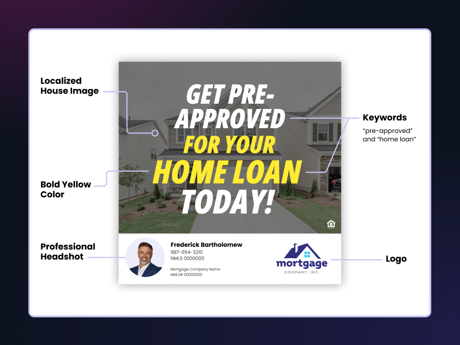
3. Use key images and keywords strategically
The fastest way to communicate “this is a mortgage ad” is through recognizable imagery and strategic keywords. Your audience should immediately understand what industry you’re in and what you’re offering.
Key images that work for mortgage ads:
- Houses or homes (exterior shots work better than interiors)
- Keys, especially house keys on keychains
- Happy homeowners or families in front of homes
- “Sold” or “For Sale” signs
- Handshakes or documents (for refinance or business-focused ads)
Keywords to include on the image:
- “Home Loans”
- “Mortgage”
- “Refinance”
- “Pre-Approval”
- “Low Rates”
- “First-Time Buyers”
These visual and text elements work together to create instant recognition. Someone scrolling through Facebook should know within a fraction of a second that this is a mortgage-related ad, not a real estate listing or banking service.
Below is a really good example of an ad that is really simple and has keywords like “DSCR loans”, “rental property”, and “mortgage”. Having these keywords is even more important when you’re advertising a service someone might not be aware of. Acronyms like DSCR, HELOC, and VA loan need more explanation than a typical “we help with your mortgage loan” ad.

Pro tip: Place your keyword text in a contrasting color against your background to ensure readability on both mobile and desktop.
4. Build strong brand presence
Your brokerage’s brand has recognition and trust that you can leverage in your ad images. Best practices for mortgage ad images include maintaining brand consistency through logos, colors, fonts, and design elements.
Many loan officers feel they need to create their own separate brand, but we’d argue that this actually weakens your advertising. Your company has likely invested significant resources in building brand awareness—use it.
How to incorporate strong branding:
- Use your brokerage’s exact brand colors (not “close enough”)
- Include the official logo in a prominent but not overwhelming position
- Apply brand fonts for any text on the image
- Follow any existing brand guidelines for design elements
If you’re a loan officer without design experience, reach out to your marketing team. Here’s a strategy that works: create a first draft of your ad image, then ask for feedback. Marketing teams are much more likely to help when you’ve taken the initiative to start the design yourself. They can guide you on proper brand usage and may even refine the design for you.
5. Add local relevance when possible
Localization makes your ads feel personally relevant to your target audience. While you can’t localize every ad image, including geographical references when appropriate significantly improves performance.
Ways to add local relevance:
- Include the city or neighborhood name in the text overlay
- Use images of recognizable local landmarks or scenery
- Feature home styles typical to your area (ranch homes in the Midwest, adobe in the Southwest, etc.)
- Reference local market conditions (“Minneapolis Home Loans” or “Austin First-Time Buyers”)
For example, if you’re targeting potential homebuyers in Minnesota, an image featuring a cozy home with snow-covered pine trees immediately signals “this is for me” to local viewers. That same image would feel completely disconnected to someone in Florida.
When you’re running ads for different geographical areas, create variations of your image with localized elements rather than using one generic design for everyone.
[
View this post on Instagram
](https://www.instagram.com/reel/C-iYuDBpp-P/?utm_source=ig_embed&utm_campaign=loading)
6. Balance polish with authenticity
Finding the right level of polish is one of the trickier aspects of best practices for mortgage ad images. Too corporate, and you lose the personal connection. Too amateur, and you lose credibility.
Overly polished pitfalls:
- Stock photography that looks too generic
- Designs that could belong to any major bank
- Perfect, sterile imagery that doesn’t feel local or personal
Unprofessional pitfalls:
- Obvious clip art or low-quality graphics
- Inconsistent fonts and colors thrown together
- Blurry or pixelated images
- Poor color combinations that are hard to read
The sweet spot is professional but approachable. Your ad should look like it was designed by someone who knows what they’re doing, but it should still feel personal and locally relevant.
Here are two examples below. The ad on the left is much more polished and feels more corporate. The ad on the right is a little less designed. It has an emoji to bring some personality into the ad. It’s important to note that both ads can be effective. This is why it’s important to test each ad and see which one performs better in your market.
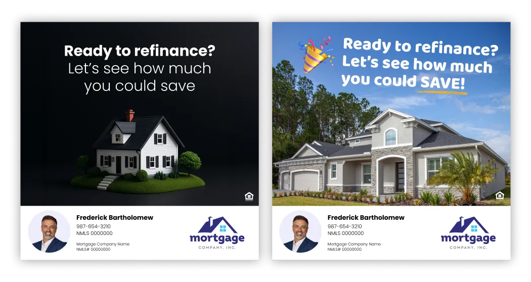
Interestingly, some mild imperfection can actually build trust. When potential borrowers can tell a real person created the ad (rather than a massive corporate marketing machine), they’re more likely to engage. This authenticity signals that they’ll be working with a real person, not just a faceless institution.
Test different approaches to see what resonates with your specific market. Some areas respond better to highly polished designs, while others prefer more authentic, personal touches.
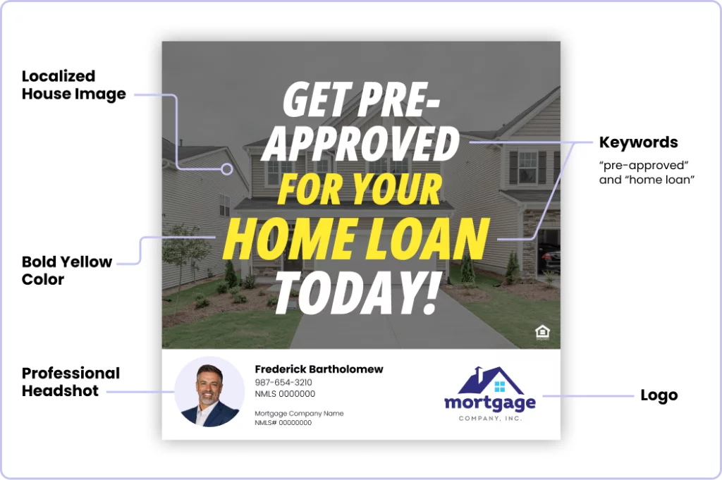
7. Personalize with your headshot and name
One of the most effective best practices for mortgage ad images is including your personal branding—specifically, your headshot and name. This creates authentic human connection and helps potential borrowers see the real person they’ll be working with.
Why personalization works:
- Builds immediate trust and credibility
- Differentiates you from corporate, faceless competitors
- Allows potential clients to put a face to the name
- Creates familiarity before the first conversation
How to include your headshot effectively:
- Use a professional, high-quality photo (no selfies or casual snapshots)
- Ensure good lighting and a clean background
- Smile and appear approachable
- Make sure your face is clearly visible, even on mobile devices
- Avoid AI-generated or heavily filtered images that look fake
You can experiment with different sizes—sometimes a larger headshot works better for building personal connection, while other times a smaller profile image alongside your message performs well.
Always include your name on the image as well, preferably with your title. “John Smith, Senior Loan Officer” or “Maria Rodriguez, Mortgage Specialist” helps people remember who you are and reinforces your professional credentials.
Authenticity is key here. People connect with real people, not polished corporate perfection. Your headshot should look professional but still capture your personality.
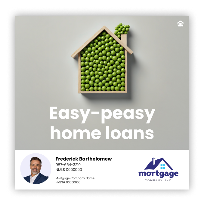
8. Consider tone and personality
Your ad image should reflect your personal brand and the tone you want to convey. There’s no one-size-fits-all approach. What works depends on your personality, your market, and your target audience.
Tone options to consider:
Humorous: Use wordplay, clever visuals, or light-hearted elements. This works well if humor is part of your personal brand and your target audience appreciates a less serious approach. Below is an example of this ad type:
Bold and Loud: Use bright colors, large text, and eye-catching design. Alec Hanson, Head of Revenue Development and Growth at loanDepot, uses the same neon green from the loanDepot brand in all his content, making his posts instantly recognizable. While you might not want to go full neon, using a distinctive color palette can set you apart.
Below is another example of an ad that is bold. The ad image uses a bright yellow color and a thicker font choice to really capture your attention.
Professional and Trustworthy: Use classic colors, clean design, and authoritative imagery. This works well for luxury markets or when targeting more conservative audiences.
Warm and Welcoming: Use softer colors, friendly imagery, and approachable design. This is effective for first-time homebuyers who might feel intimidated by the mortgage process.
Educational and Expert: Use charts, data, or informative graphics. This positions you as a knowledgeable resource and works well when your CTA is educational.
The key is consistency. Whatever tone you choose should be reflected across all your ad images and marketing materials. This consistency builds recognition—people should be able to identify your ads even before they see your name or logo.
Putting it all together
That’s our list of best practices for mortgage ad images. It comes down to a few core principles: simplicity, clarity, authenticity, and strategic design. Your ad image should immediately communicate who you are, what you’re offering, and why someone should care—all in a single glance.
Start with one or two ads implementing these principles. Pay close attention to performance metrics, and refine based on what works. The loan officers who consistently generate quality leads through advertising aren’t necessarily the best designers—they’re the ones who understand their audience and continuously improve their approach.
Remember that your ad image is one component of effective digital marketing. The landing page experience, ad copy, targeting, and follow-up all matter tremendously. A strong image gets people through the door.
Ready to put these best practices into action? Evocalize makes it simple to launch professional mortgage ads across Facebook, Instagram, and Google with pre-tested images and automated optimization. Create your free account today and start generating quality leads with ads that actually convert.
In closing, the best mortgage ad image you’ll ever create is the one you test, refine, and optimize based on real results from your local market. Start simple, stay authentic, and let performance guide your decisions.